How far apart are the incomes of the rich and poor in different countries?

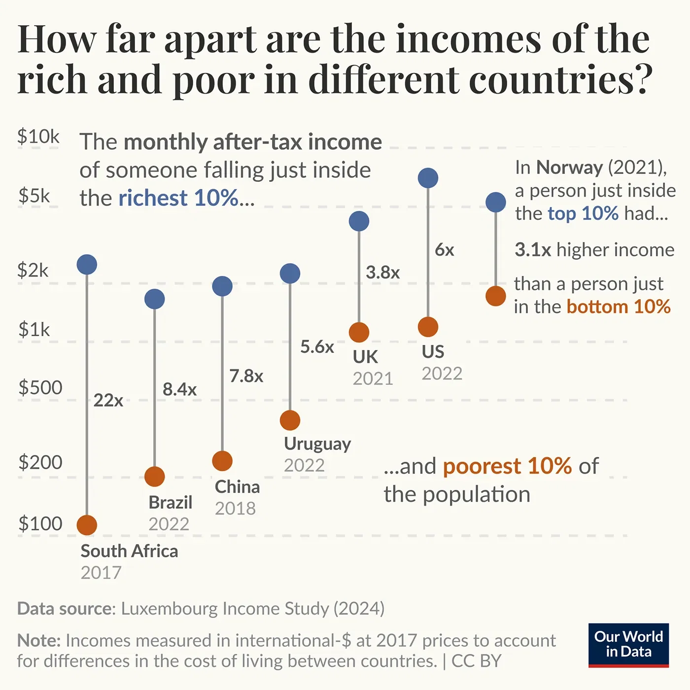
How far apart are the incomes of the rich and poor in different countries? The chart shows how incomes are spread in several countries in different world regions.
The data comes from the excellent Luxembourg Income Study. Blue points show the monthly after-tax income of someone who falls just inside the richest 10% of their country's population. Red points show the income of someone who falls just inside the poorest 10%.
To allow for comparisons, all incomes are shown in international dollars, which account for differences in cost of living across countries. The ratio between these two numbers gives us a measure of inequality known as the “P90/P10 ratio”. In Norway, a country with very low inequality, this ratio is around 3. A person just inside the richest 10% has a monthly income of $5,490 — a little more than 3 times the $1,760 earned by someone just inside the poorest 10%.
In the United States, inequality is much higher, and the ratio is twice as large — around 6. The chart shows that the richest 10% are much richer than those in Norway, with incomes above $7,440. But, the poorest are also poorer, with incomes of less than $1,240. In many countries, the ratio is between 4 and 6. But in the most unequal countries, it is much higher.
In South Africa, the ratio is 22. Those in the bottom decile are among the poorest people in the world, living on less than $110 per month. In contrast, the richest 10% earn $2,490 or above — higher than the incomes of half the UK population and nearly a third of the US population.